Matirot
Some knots are meant to be untied.
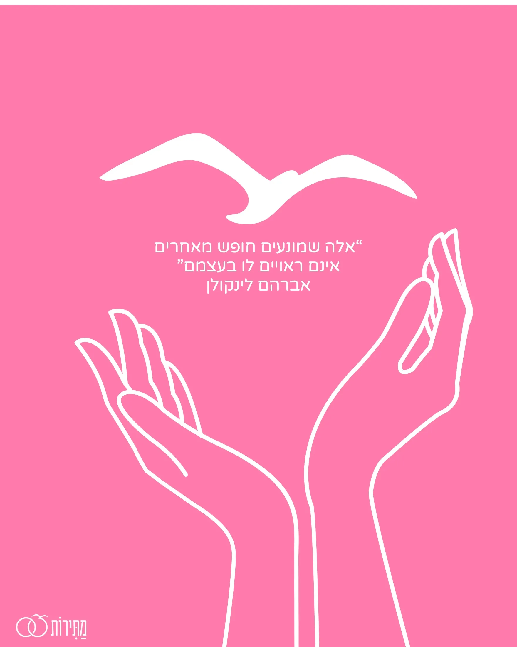
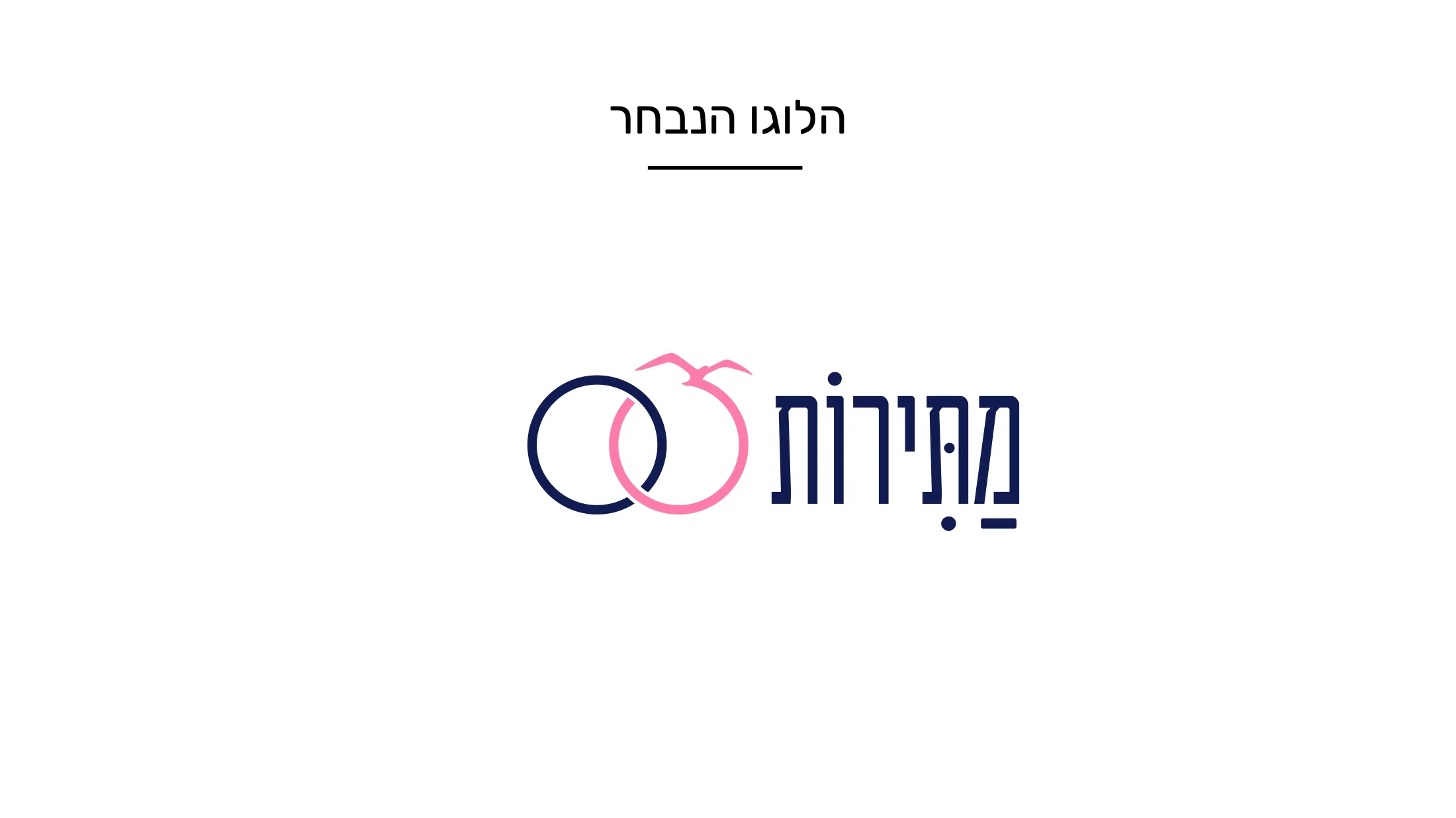
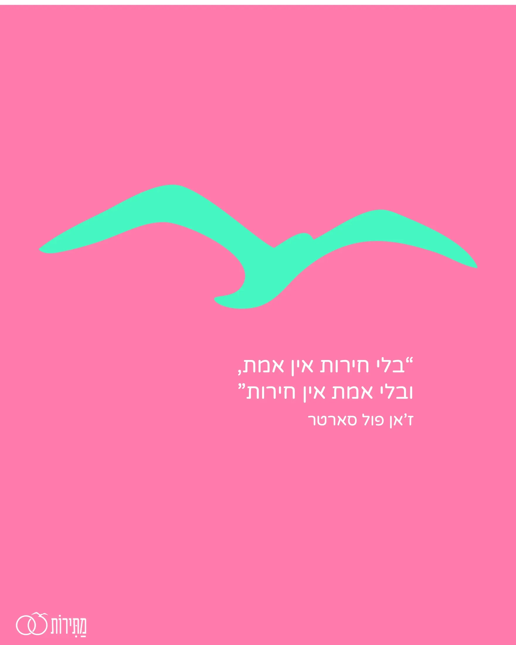
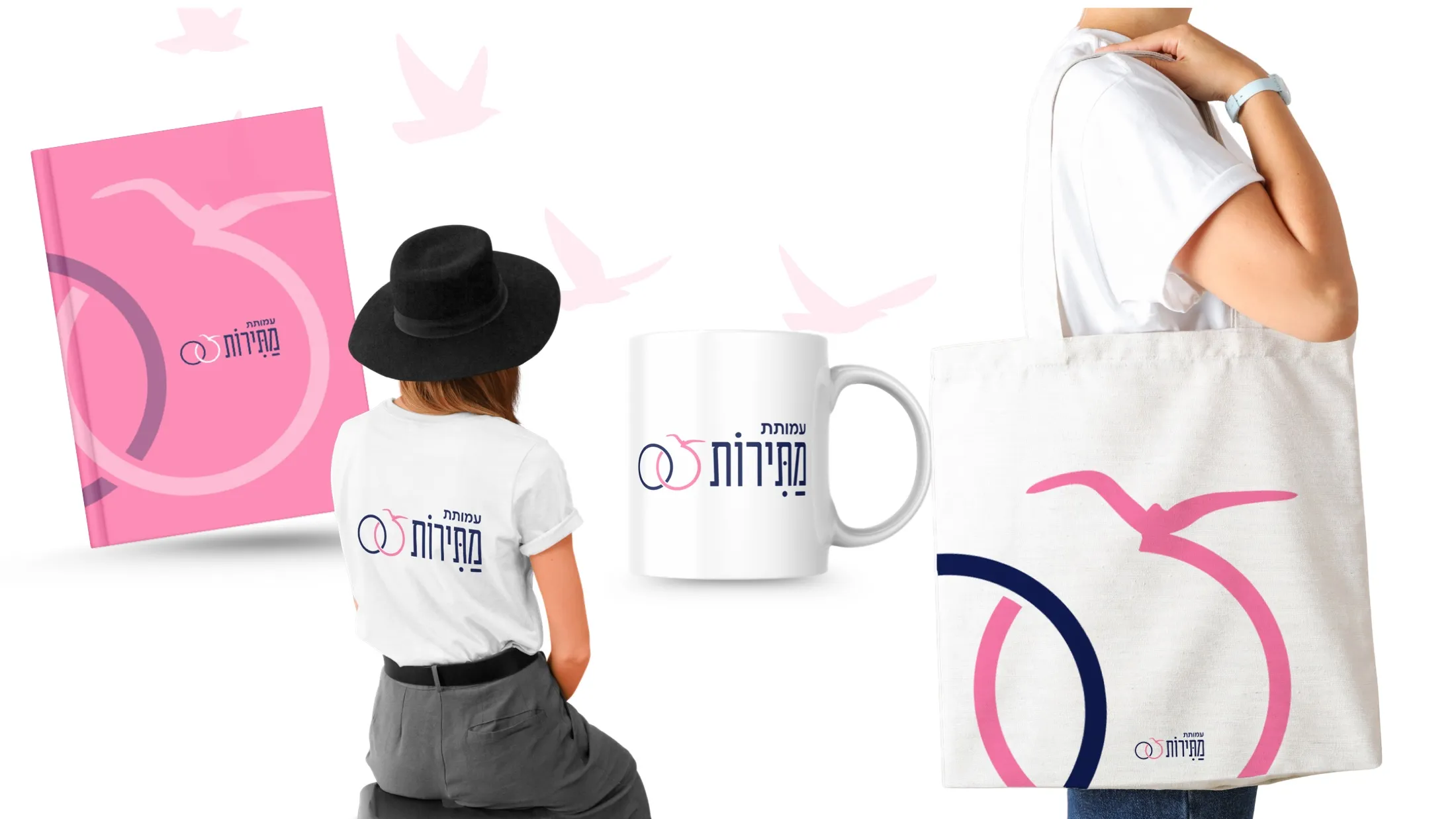
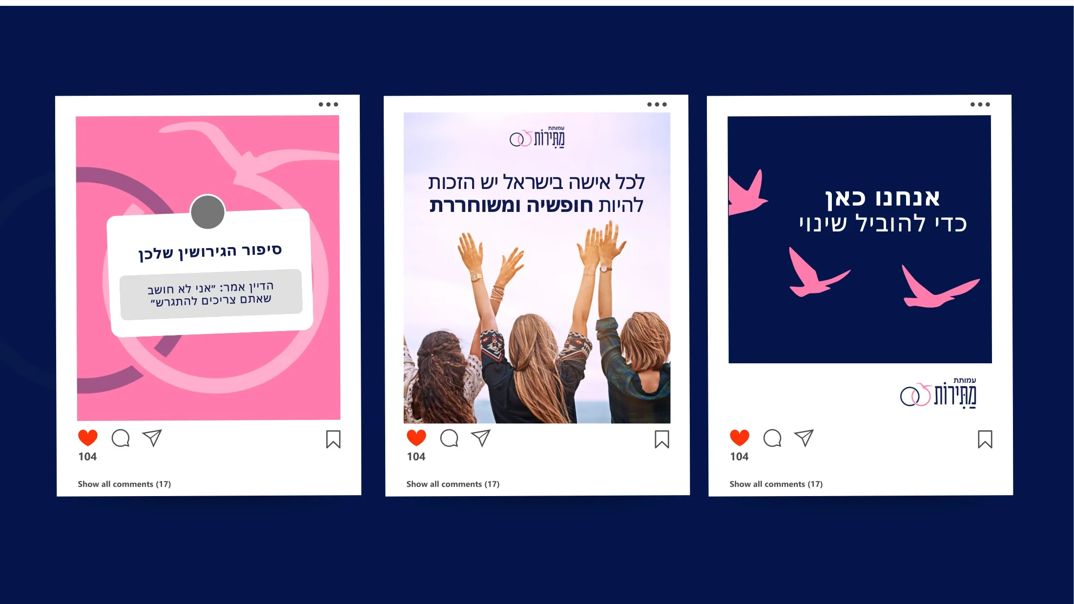
A nonprofit that frees women trapped in denied divorces needed a brand as brave as the women it serves. The chosen direction pairs two linked rings with a bird in flight, and a social language that speaks gently about hard things.
19 Designed as part of my work at Group19 Digital.
- Client
- Matirot — freeing agunot
- Year
- 2025–2026
- Disciplines
- Branding, Logos, Social
- Role
- Brand & graphic designer
- Agency
- Group19 Digital
The brief
Refresh the Matirot identity and give its social channels one consistent, recognizable voice.
What I delivered beyond it
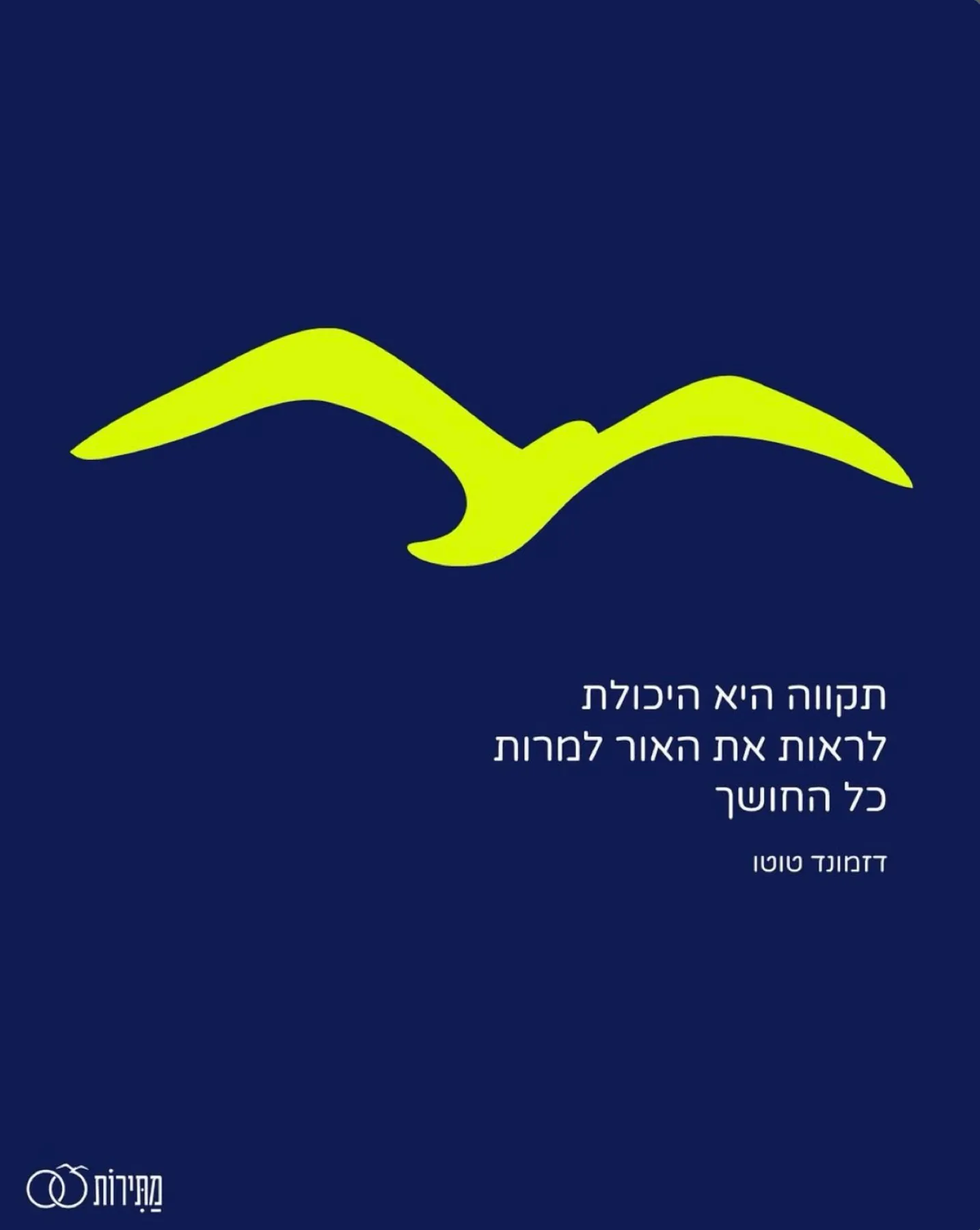
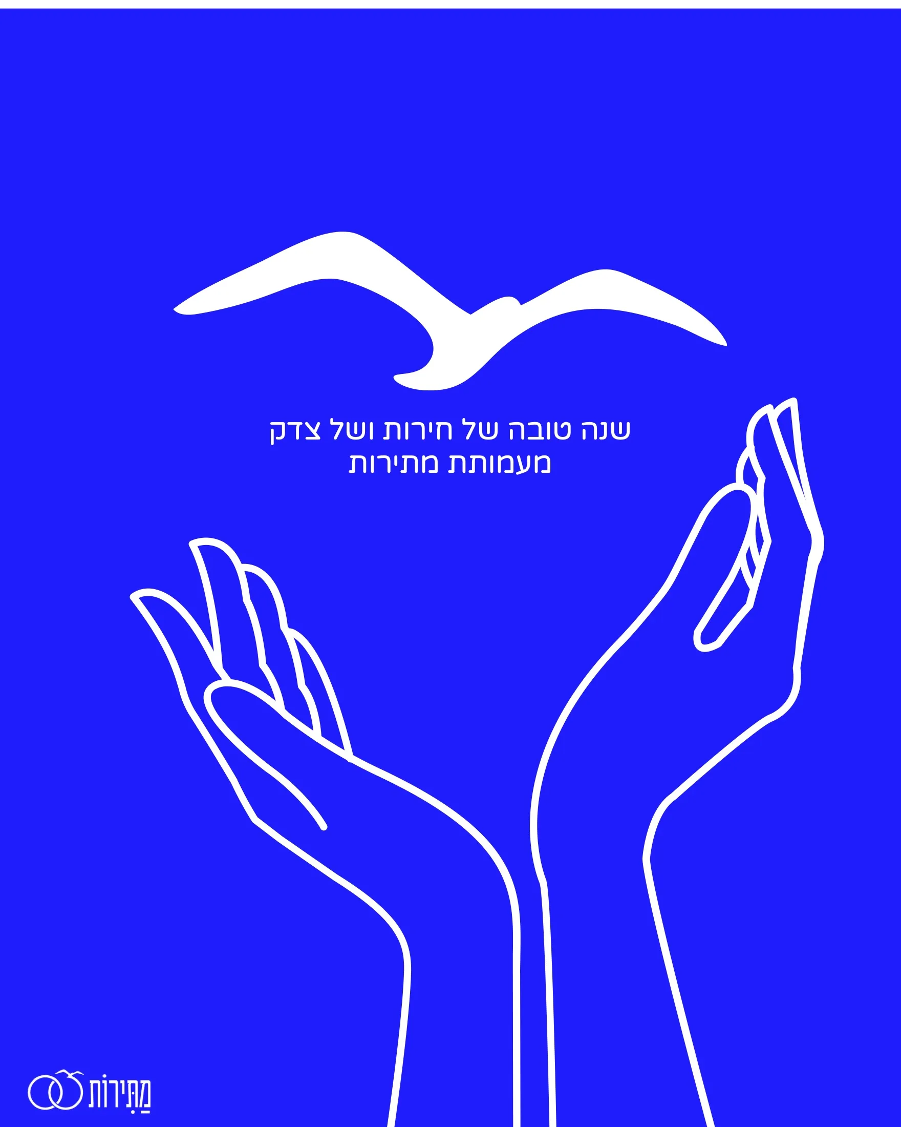
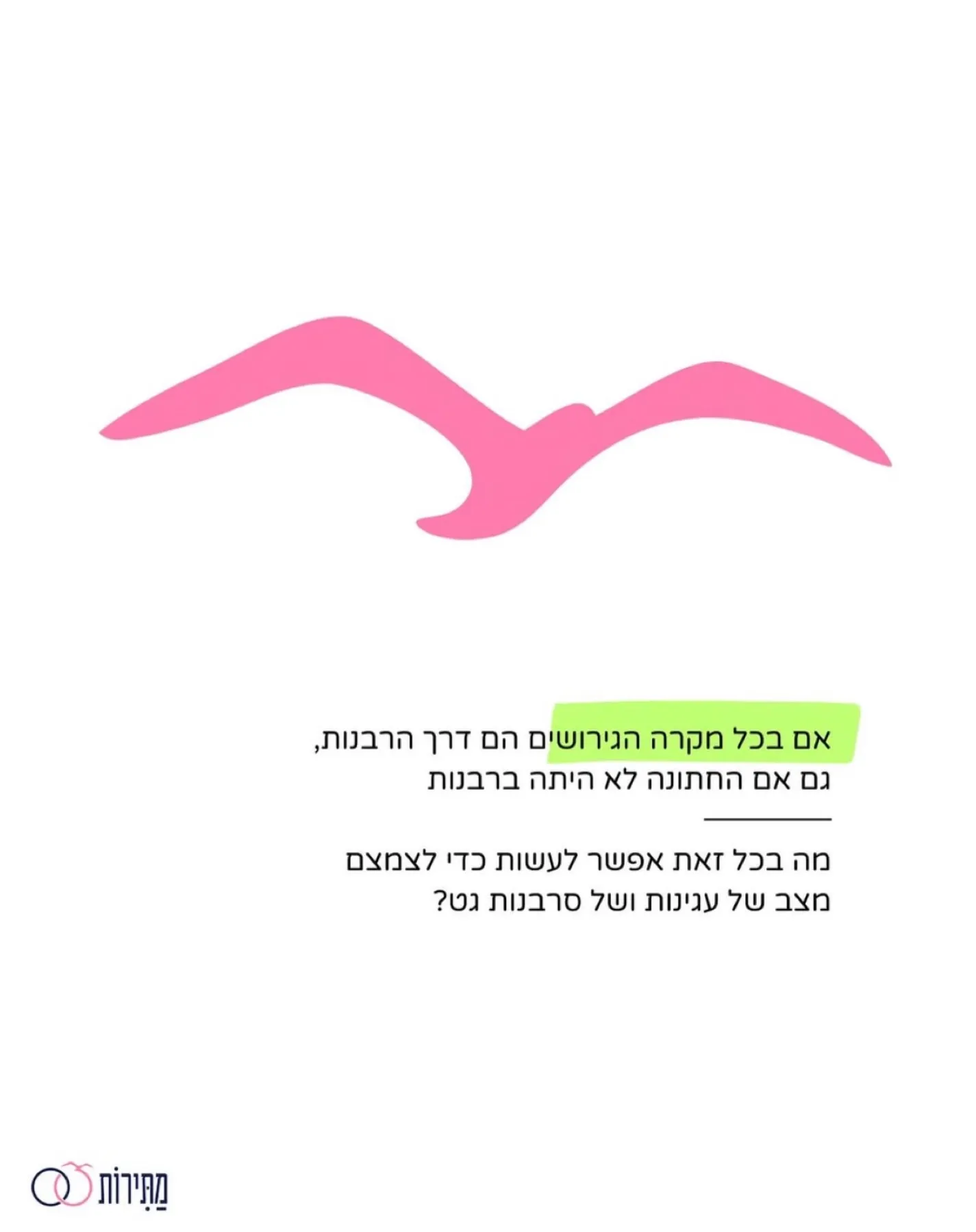
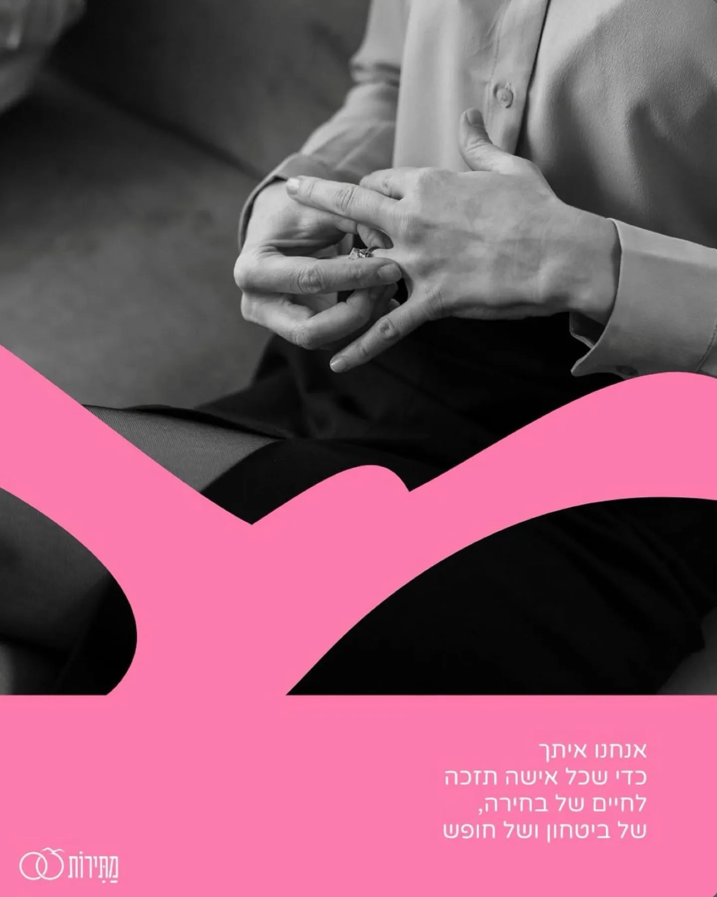
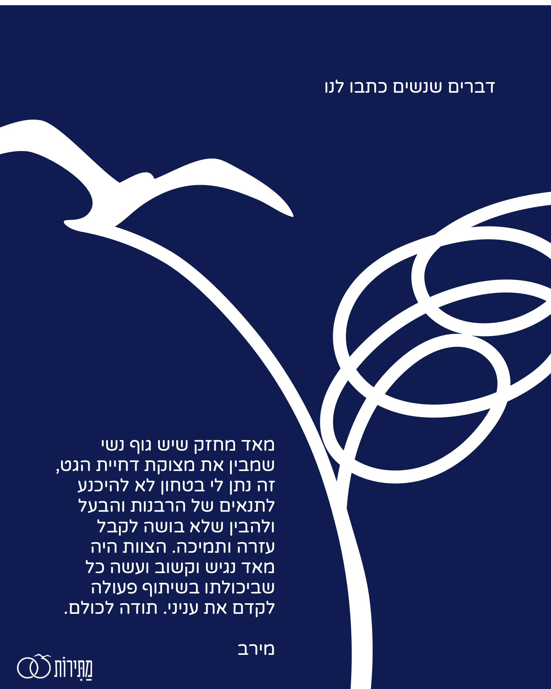
A logo of two rings, one set free. A graphic language built around a bird in flight, in pink, navy, lime and orange. A modular post grid the team can keep producing on its own, merch, and motion greetings for the High Holidays.
Process
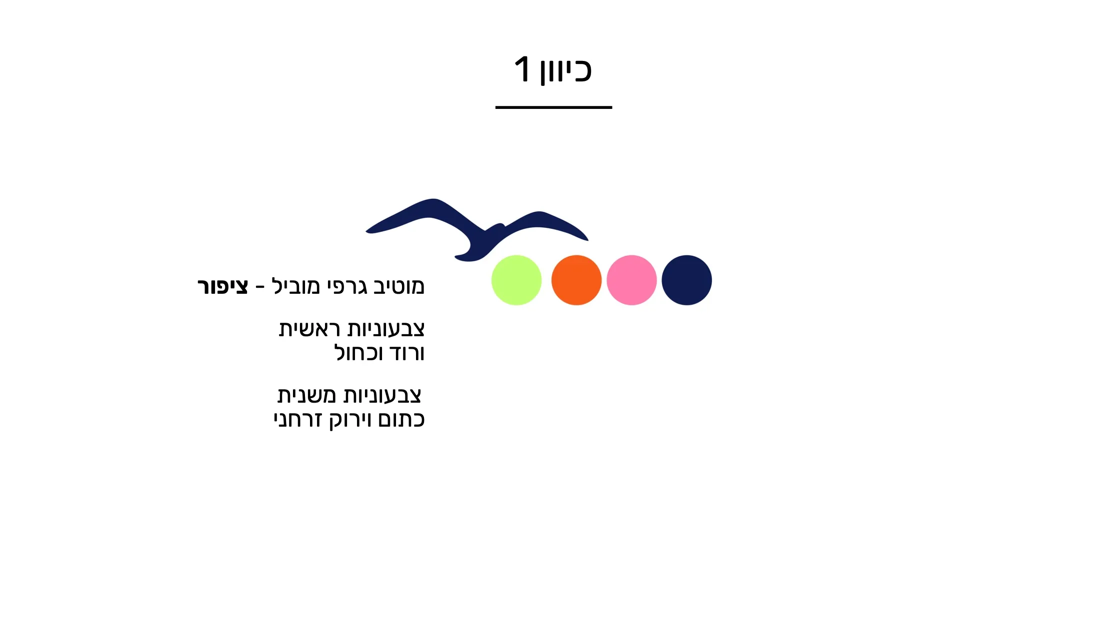
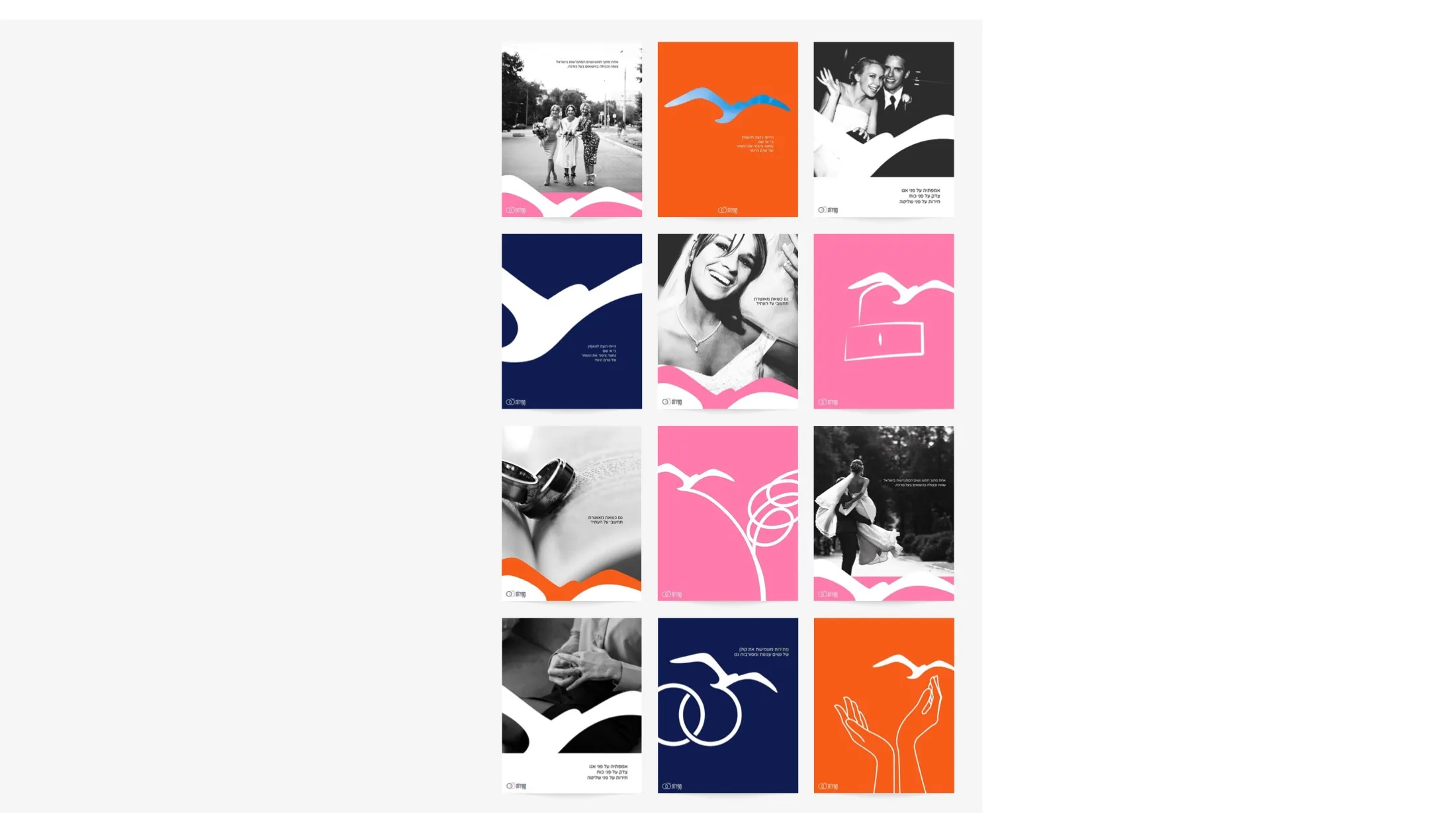
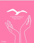
Some of these posts were never published: they were made to show the client possible directions, so the copy isn’t necessarily about Matirot directly.
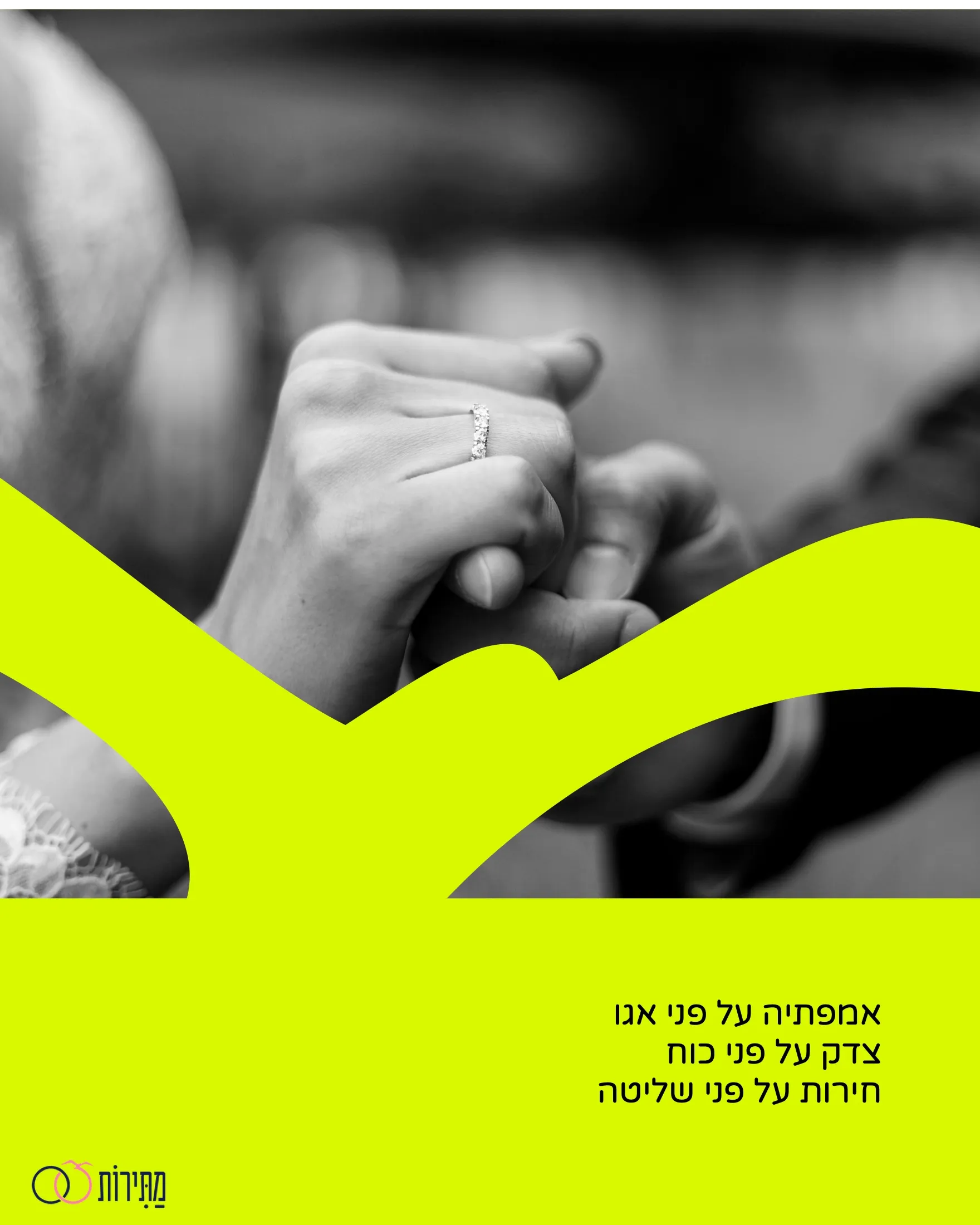
The result
Next project
Judged by its cover. Acquitted.
Mogu →