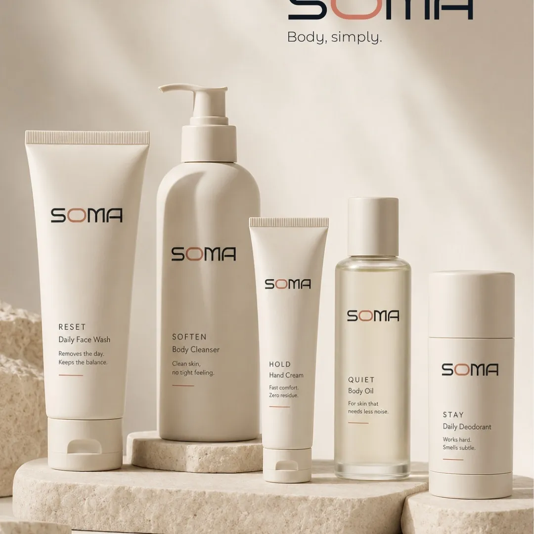
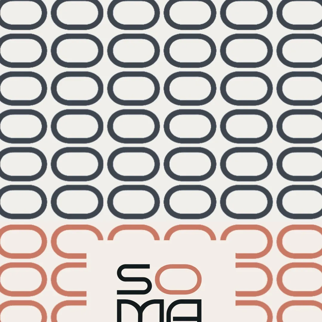
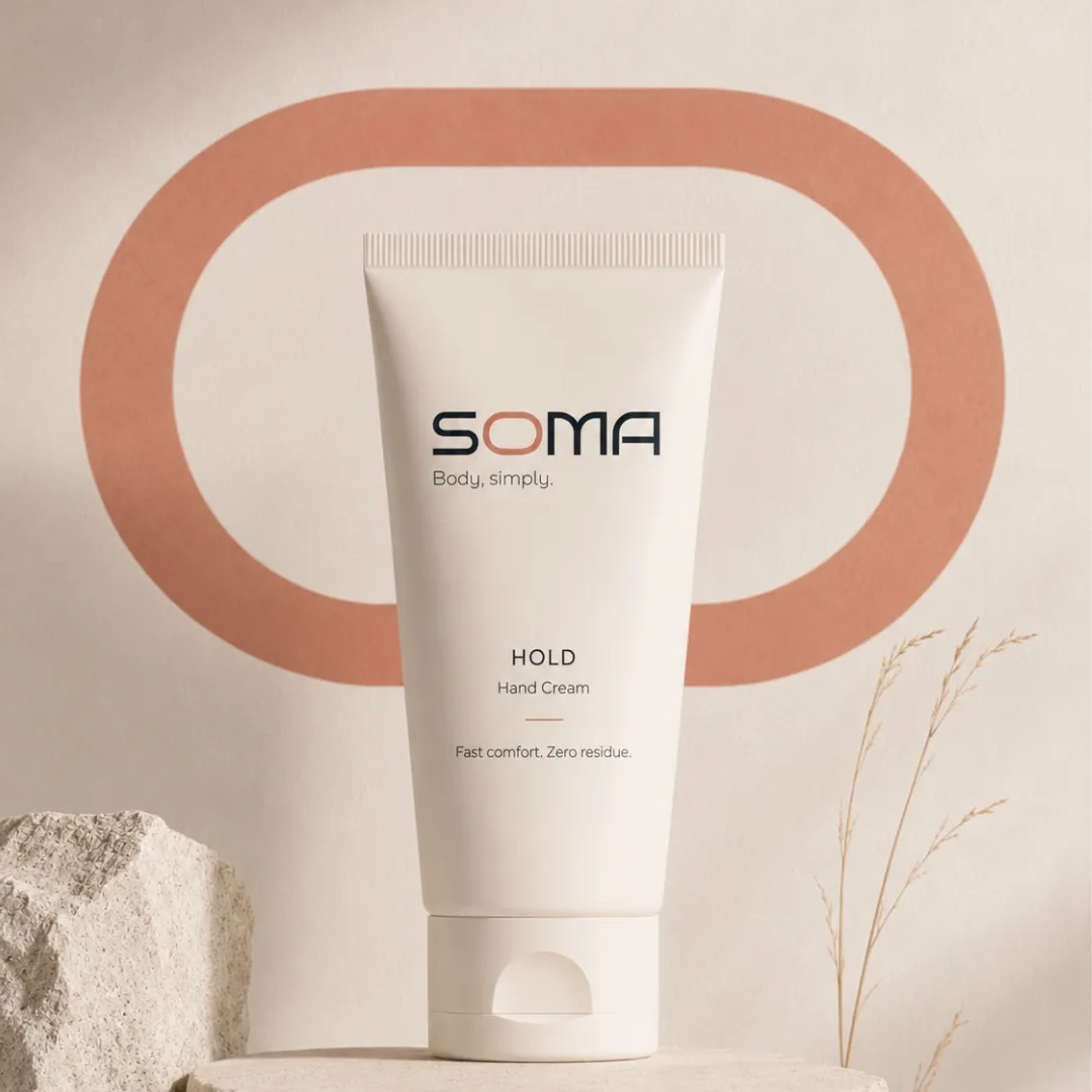
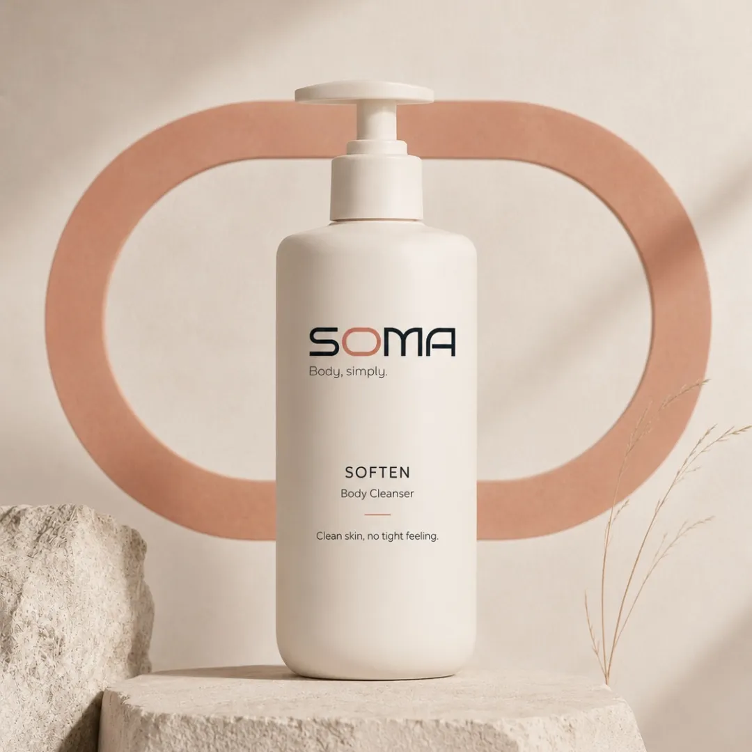
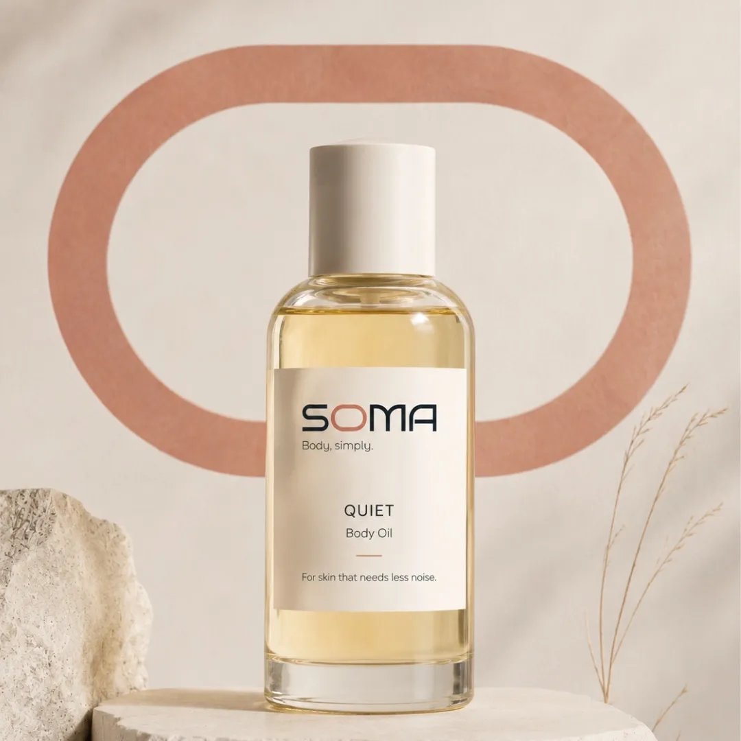
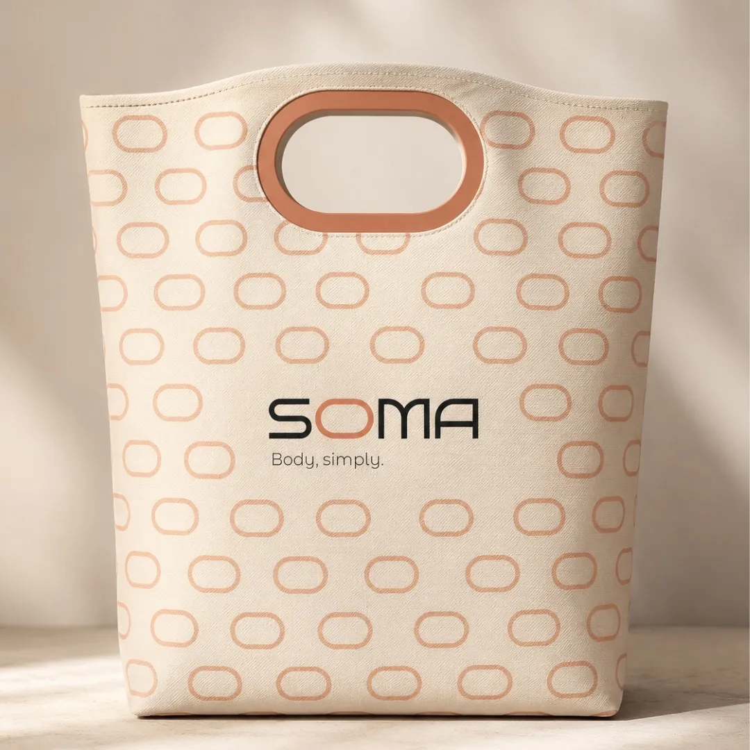
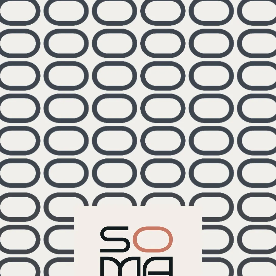
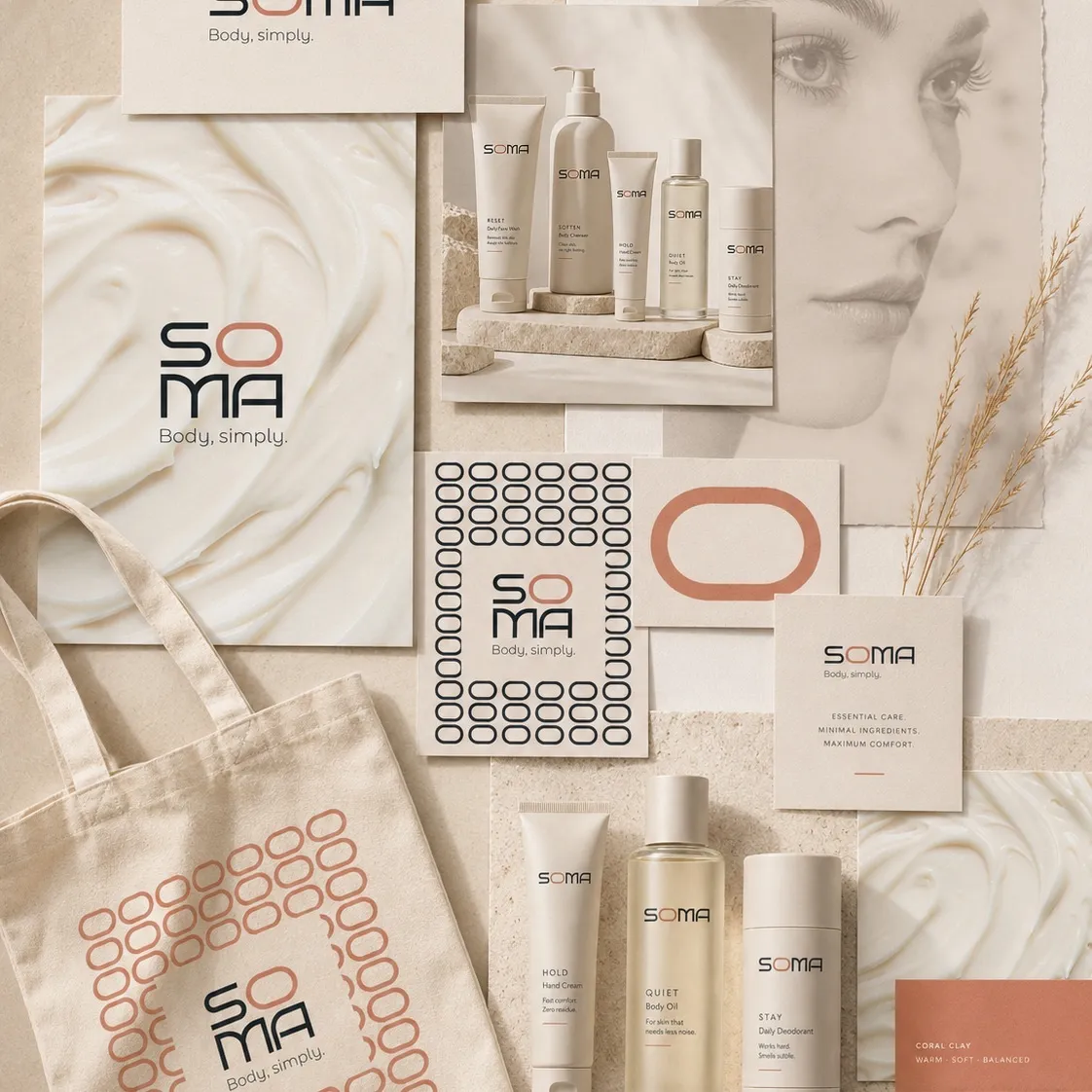
Branding for a minimalist body-care brand. The challenge was a language that feels clean and precise but still warm and human. The O in the logo became the brand’s central asset: color, shape, pattern and a motif that returns at every touchpoint.
Client
SOMA — Body, simply (concept brand)
Year
2026
Disciplines
Branding, Logos, Packaging
Role
Brand designer
The brief
Build a minimalist body-care brand that stays warm, so it doesn’t end up as just another white bottle on a shelf.
What I delivered beyond it
One letter that carries the whole system: the O becomes a frame, a handle, a pattern and a print. A soft terracotta-and-cream palette, a full product range, a tote and stationery, all from the same shape.